Client: Hearing Care Solutions
Project: Fully rethink and redesign the current website. Build a refreshing user experience based on the newly created style guide. Lead the process from start to finish.
End Users: US Americans aged 60+ who may have hearing loss // national & local health plans // hearing care providers
My Contribution: UX audit on former site, interface design, graphic design & illustrations, copywriting, development, project management
Problem Statement: Health plan members need to be able to quickly and easily contact HCS to make an appointment and learn more about hearing loss in order to improve their quality of life as soon as possible. Health plans and providers need to be able to quickly and easily get in touch with HCS to learn about the benefits of working together so that they can provide hearing services to more people.
Our chief concerns with the old site were that it was overwhelming, difficult to navigate, and out of date. It was frustrating trying to find information in the non-intuitive navigation, and an overload of content was distracting from the pertinent information. Therefore, our new designs prioritized consolidating information, eliminating unnecessary submenus, reducing visual clutter, and re-thinking CTAs.
Visit the site: www.hearingcaresolutions.com
Former locations page
New locations page
Former lifestyle/hearing aid guide
New lifestyle/hearing aid guide
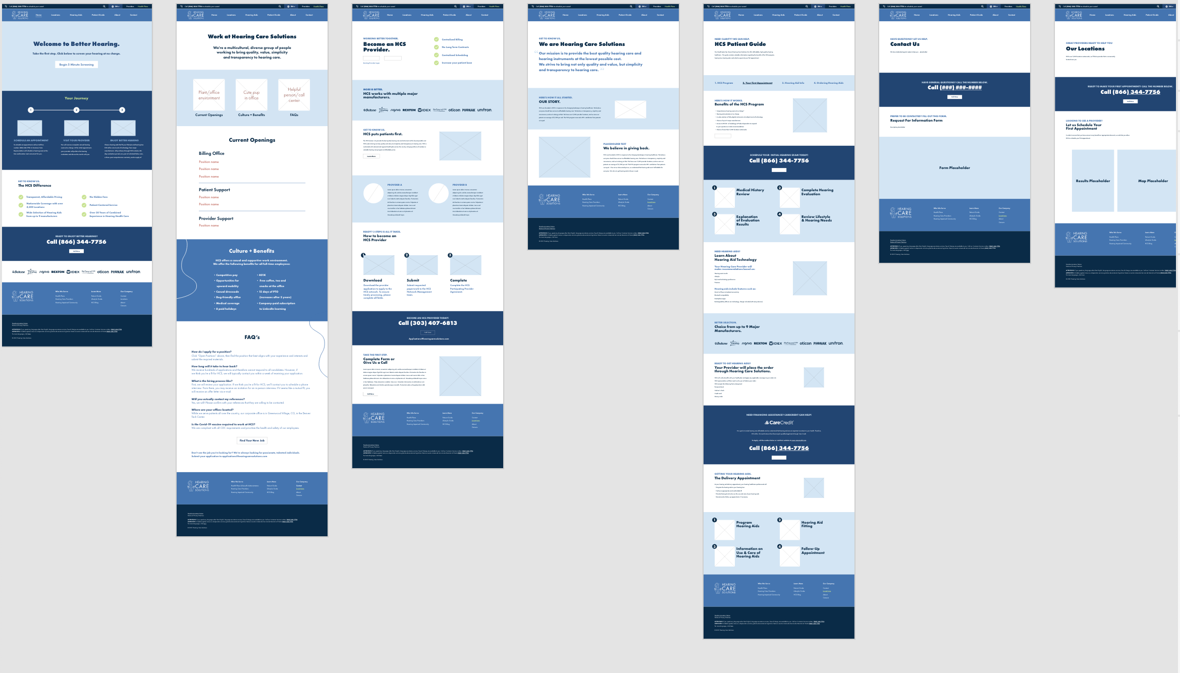
Process + Wireframes
Here’s how I went about this project:
Reviewed the current website, made notes and prepared questions for the client
Met with the client to understand their business needs and their users’ needs, posed my questions and discussed general suggestions/direction
Researched and spoke with different types of users in order to empathize and design a better experience (this included seniors with hearing loss, audiologists, health plan reps, and hearing care providers)
Defined site priorities for both the client’s business needs and user needs
Ideated with sticky notes to determine site structure, drew rough sketches with a pen and paper, worked as a team to create user flows
Created wireframes in Adobe XD
Built up a prototype in Adobe XD
Received feedback from the client using XD’s design review tool and a combination of virtual + in-person meetings
Developed the site, conducted informal usability tests, iterated on it per client requests
Go live!
Ongoing: monitor site analytics; iterate as necessary.
Results
HCS won the business of a Fortune 200 health care company explicitly because of the new branding and website design.
Website load time went from a tedious 5-30+ seconds to instantaneous
Site is now poised to score highly on compliance audits
Completely cleaned up website backend, making it easy for future designers/devs to work on the site
Glowing feedback from stakeholders


