Client: Gabriel Barrera (ScenicG)
Project: Using existing assets, fully redesign and restructure the website for a multi-faceted artist. Clarify offerings, add e-commerce, and create an enjoyable user experience for three distinct audiences.
End Users: Artistic grant makers // Fellow artists and potential mentees // Current and potential clients
My Contribution: UX design, UI design, Squarespace development, project management
Problem Statement: The current website doesn’t make it clear what ScenicG offers and to whom. Grant makers should be able to quickly understand ScenicG’s impact and gain trust so that he is awarded more grants and can keep making a positive impact on BIPOC artists and communities. Mentees, artists, and potential clients should be able to sign up for workshops, attend events, shop, and/or collaborate with ScenicG without friction.
Gabriel was awarded a $100,000 Field Artist Fellowship in 2021. Given his new resources and ability to expand his offerings, Gabriel was excited to commission a website redesign that would help him reach more people. Gabriel’s priorities were making his offerings obvious, highlighting his own artistry, adding e-commerce, and generally updating the website for a more pleasant user experience.
Much of his work is somber and political (Artivism is a key word), but he also mentors youth and creates scenic art. With that, he wanted to find the balance between “too bright” and “too melancholy”. Although he already had a site, enough needed to be changed that I approached this project from square one, starting with a blank canvas.
Visit the site: https://www.scenicg.com/
Former homepage (after entry landing page)
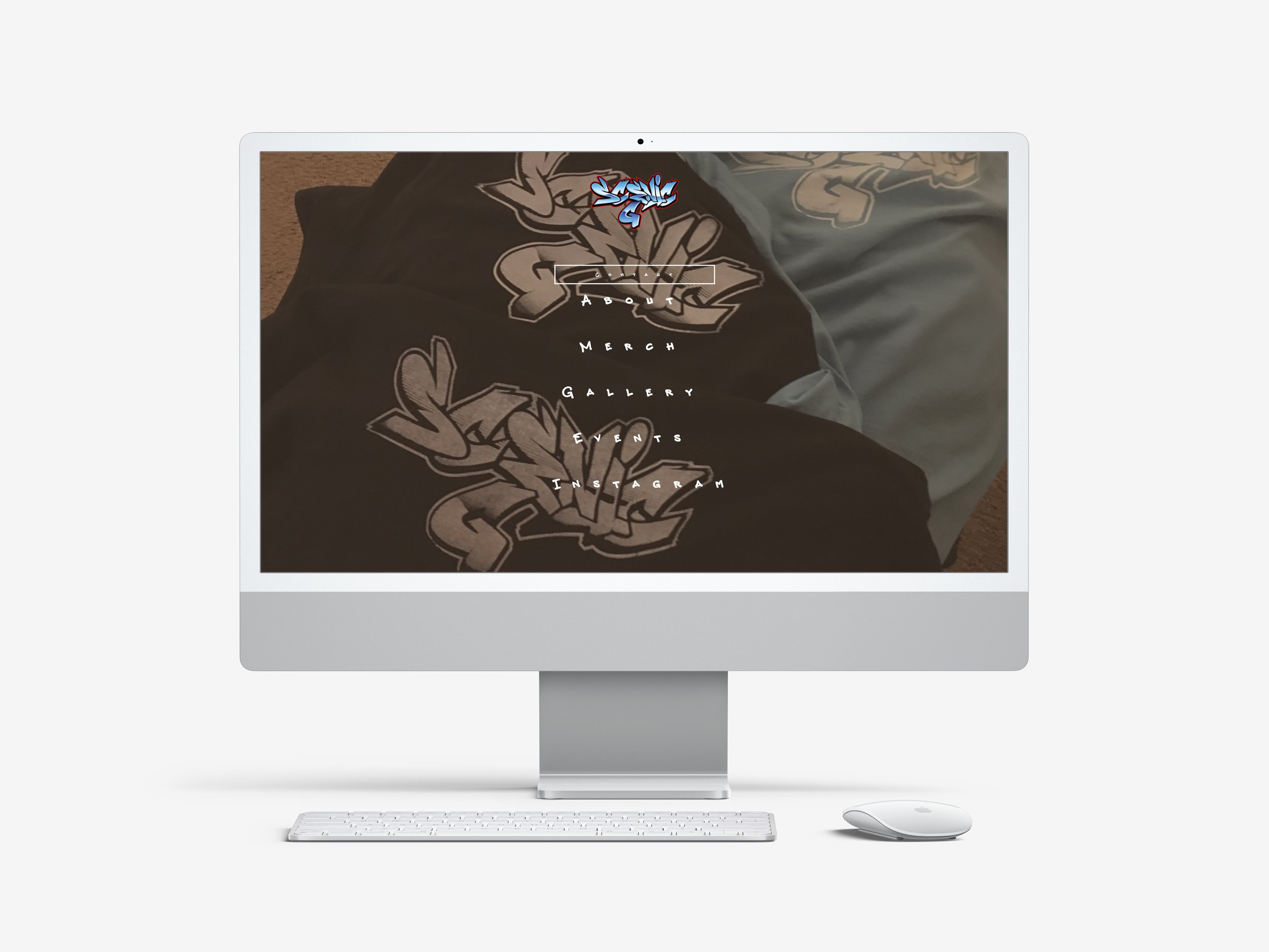
New homepage
Here’s a snapshot of some of the many changes we made:
Eliminated the entry landing page to direct visitors straight into the content they’re looking for
Designed a completely new content structure
Added clear CTA’s
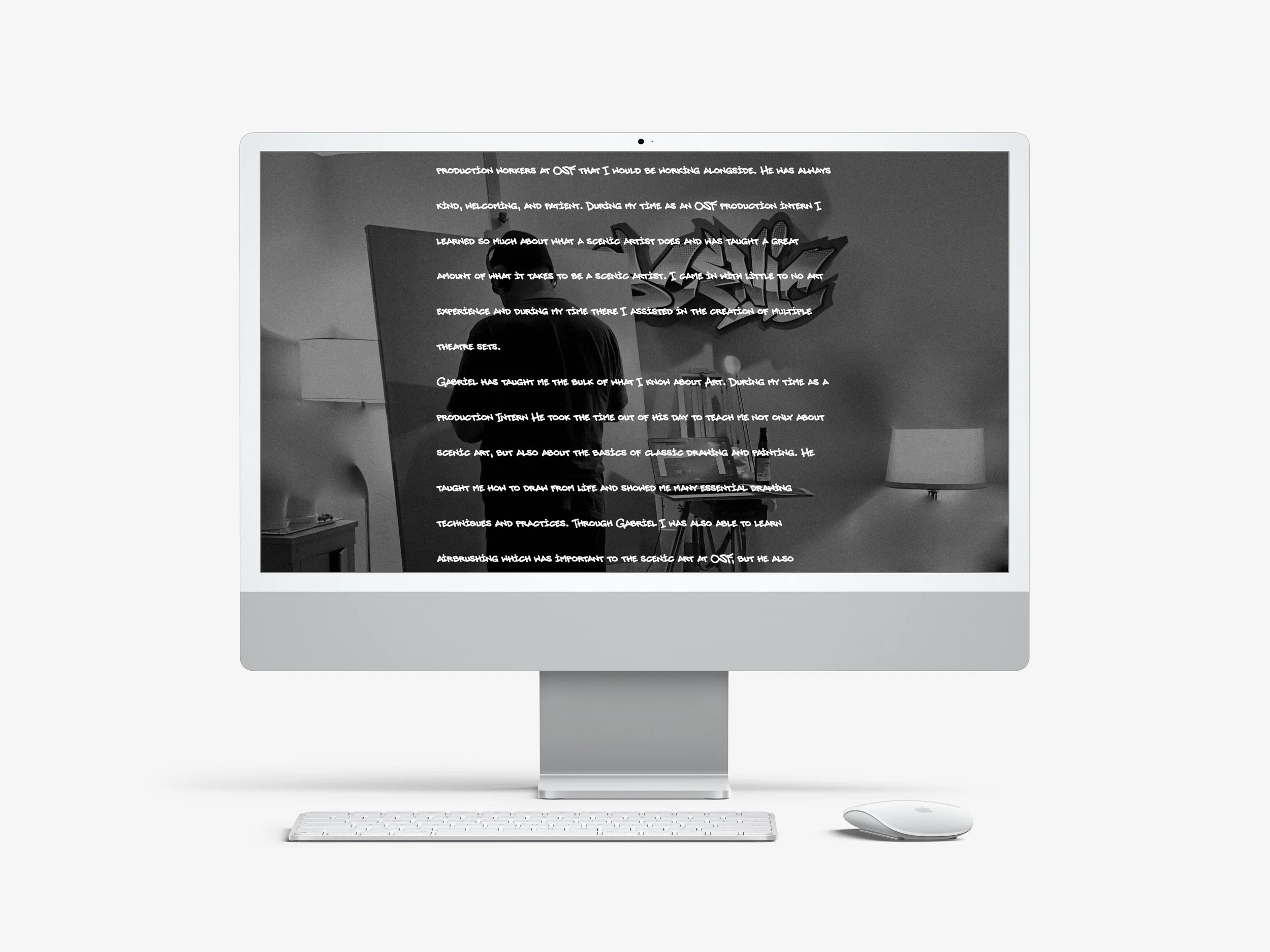
Eliminated lengthy text blocks in favor of graphs, quote callouts, and shorter paragraphs with a more readable font and engaging hierarchy
Added e-commerce functionality to the site
Former mentorship page (an extremely long page of testimonials with no information about the program itself or how to join)
New mentorship page above the fold
Added graphs to mentorship page for grant-makers to review quickly
Highlighted just two strong testimonials, rather than the lengthy page of testimonials from the previous site
Added descriptions (written by ScenicG) of what the program entails and what to expect
Added clear CTAs for grant makers and future mentees on the mentorship page
Process
Here’s how I went about this project:
Reviewed the current website, made notes and prepared questions for the client
Had a discovery call with the client to clarify his priorities, values and offerings/content for the site. Posed my questions and discussed general suggestions/direction
Defined site requirements for both the client’s business needs and user needs
Researched, explored, gathered inspiration, ideated with pen and paper as well as google docs and google drive with the client, drew rough wireframes
Created a WIP site to show client to confirm direction
The client was very happy with the direction of the site, so we discussed follow up questions and confirmed next steps
Made final edits, and published site!
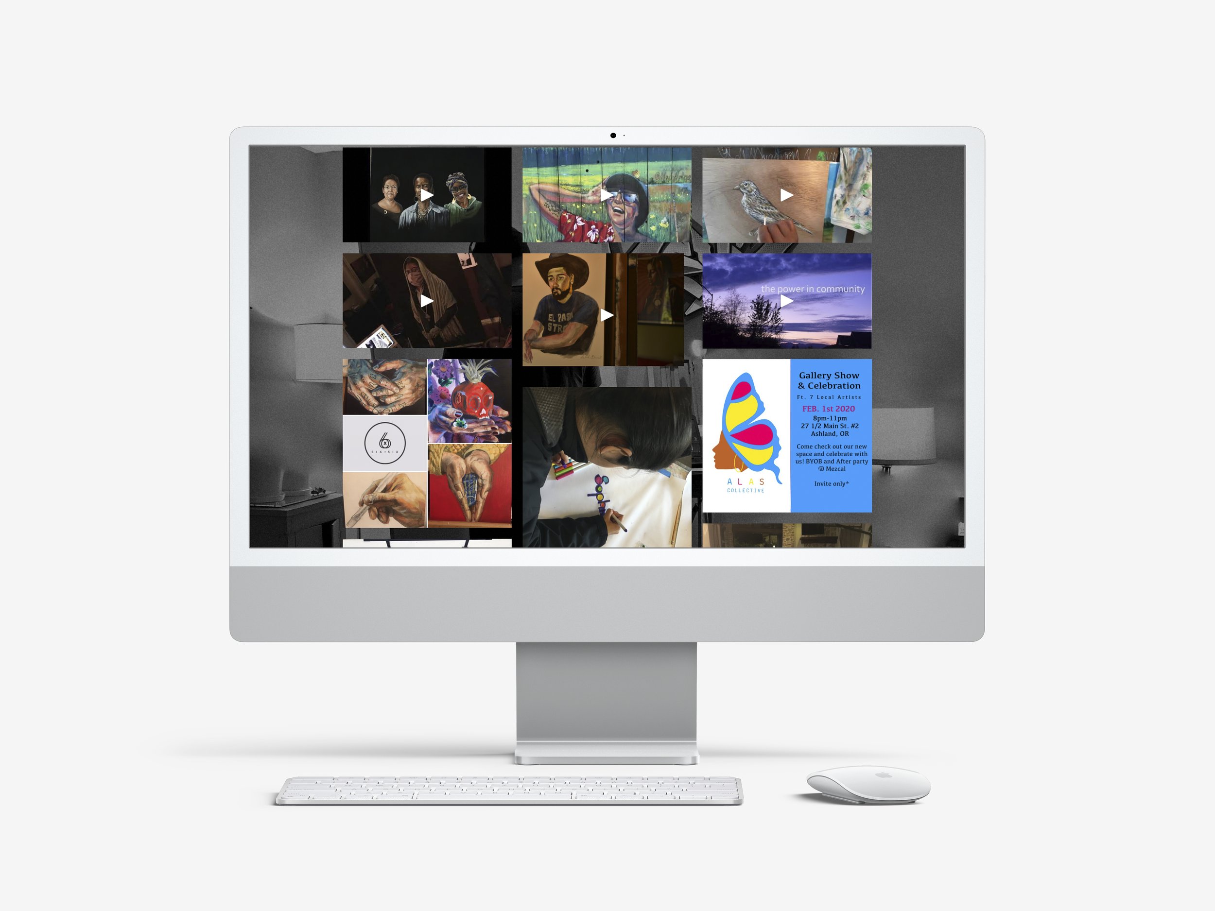
Old gallery page with a combination of event images, mentoring images, videos, digital pieces, and photos of artwork in dim lighting
New gallery page with organized portfolios and much more heroic artwork images
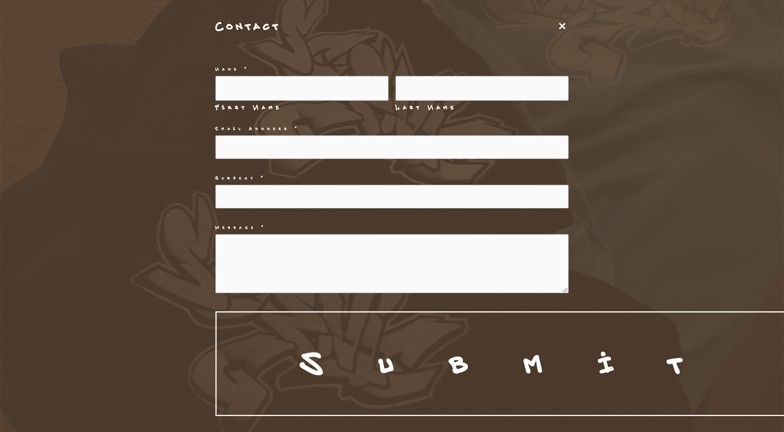
Former contact form
New contact form inviting users to submit in English or Spanish
Results
Increased web traffic by 3x-7x, depending on the month
Increased visibility for events and classes, leading to more signups and partnerships
A happy client!


